What I like about technical writing is that, as the name suggests, it builds bridges between domains, mainly technology and writing. Other fields also have a lot to say about helping people use complex tools to get things done. Cognitive psychology has shaped our daily practice by helping us understand what users actually need. Mathematics has practical tools too, and you can use them without diving deep into equations.
Graph theory, for example, can give users other ways to find what they’re looking for and see how it fits into the bigger picture, alongside classic hierarchical structures.
Graph type: star graph, K1,5.
Structure
Six vertices (the hub and five lands) and five undirected edges, one spoke from the hub to each land. The hub has degree 5 (five edges meet there), and each land has degree 1. No edge joins two lands, and that’s what makes it a strict star: add a single edge between two lands and it stops being one.
What it models
The figure’s simplified layout of the park, not a survey of every walkway. In a doc set, the same shape is a landing page that links directly to five sections. On its own, it offers no way to move from one section to another without going back through the hub.
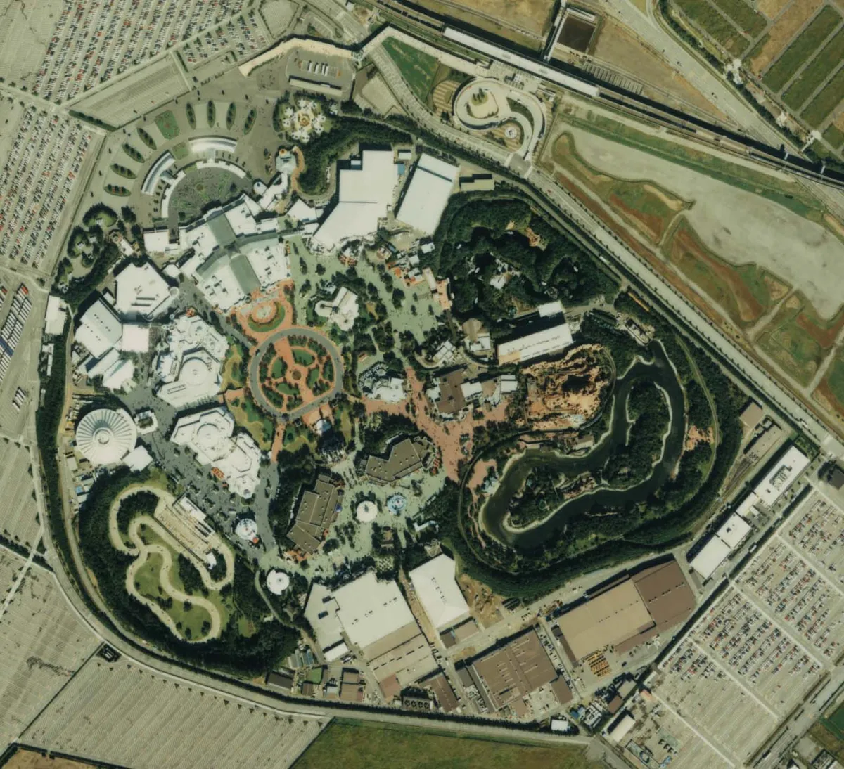
When designing information environments, we can learn from the design of physical environments. [At Disneyland,] the eventual solution that emerged was a design with a central hub, with spokes […].
Rosenfeld, Morville, and Arango, Information Architecture

Pages are nodes, edges are links
A graph is a set of nodes and the edges that connect them. Documentation is a set of pages and the links that connect them. Basically, the same structure. So you can check your documentation for the same failures as any other graph.
Each figure comes with either a graph type or a graph model.
How to read graph types and graph models
Graph theory calls nodes vertices. Where a figure draws arrowheads, each arrow is a directed edge (an arc): a link from one page to another. Where it draws plain lines, each line is an undirected edge: two pages connect, but the figure doesn’t say which one links to which. The standard names Pn, Cn, and Kn refer to undirected graphs: a path, a cycle, and a complete graph on n vertices (the subscript gives the count).
Figure 1 uses a fourth undirected name, K1,n, for a star graph: one central vertex (the hub) and n leaves. It’s a special case of a complete bipartite graph, which splits the vertices into two groups and joins every vertex in one group to every vertex in the other. In a star, one group holds only the hub and the other holds the n leaves, so every edge joins the hub to a leaf, and no edge joins two leaves.
A directed graph also has to say which way each arc points, so a directed path or cycle isn’t the same graph as Pn or Cn. The figures name these directed classes in words, such as “directed path on five vertices,” and they still count as graph types.
These two labels are this article’s own, not a split that graph theory makes. Graph type names a specific, recognizable structural class that the figure illustrates, such as a star or a directed path. Graph model describes a broader structural pattern without naming one particular class, such as a disconnected graph or a DAG. A DAG is a standard class in its own right, but it covers many different shapes, so the label alone doesn’t tell you where the arcs go. Labels on vertices or arcs don’t change which one applies: they’re data on top of the graph, and the type or model describes only the vertices and edges underneath.
Either way, the classification depends only on which vertices the edges join, not on where the figure places them: a page drawn above the others isn’t necessarily a parent, and pages drawn in a ring don’t necessarily form a cycle.
Each of the six patterns below follows the same order: the shape the graph takes, what that shape costs a reader in practice, and a question to take back to your own doc set. Treat the shape as a reason to look closer. On its own, it doesn’t prove that readers are struggling.
Graphs that don’t work
1. Disconnected graphs: users can’t reach a topic
A page can exist and still be invisible. When no chain of links leads to a node from the rest of the information architecture, users can’t reach it through ordinary navigation. In technical documentation, this often happens when useful content has no incoming links (an orphan page) or belongs to an isolated section that nothing else links into.
Graph model: disconnected directed graph: one arc plus an isolated vertex.
Structure
Three vertices and one arc, from Home to Deployment guide. Credentials setup has no edges at all, in or out, so graph theory calls it an isolated vertex. Even with direction ignored, the graph splits into two components: K2 (Home and Deployment guide) and K1 (Credentials setup). The guide’s need for the credentials page is a dependency, not an edge, and the missing edge is the problem the figure shows. A real orphan page often has outgoing links: it only lacks incoming ones. This one has neither, which is the extreme case.
In practice
A deployment guide tells readers to configure credentials first, but nothing links to the credentials setup page: not the guide, not the navigation, not a prerequisites section. Readers start deploying, hit an authentication error, and only then go looking. The page isn’t necessarily unreachable, since search or a bookmarked URL can still surface it. It just isn’t on any path the documentation offers.
What to check: Can readers reach each prerequisite from the task that requires it?
2. Single points of failure: when everything depends on one page
Some information architectures rely heavily on a central page to connect otherwise separate sections. Graph theory calls such a page an articulation point: remove it, and the graph falls apart. (Strictly speaking, the term applies when you treat links as two-way connections and ignore their direction.) In documentation, articulation points make the architecture brittle. Users might overlook the page, or someone might move or delete it. Either way, a large chunk of valuable content becomes unreachable.
Graph type: star graph, K1,4, drawn as a hierarchy.
Structure
Five vertices and four undirected edges, each with Hub at one end. Guides, API reference, Tutorials, and Operations each have degree 1. The figure places Guides above Hub and the other three sections below it, but in the graph all four play the same role: they’re the leaves of the star. The figure draws no arrowheads, so it doesn’t say which way the links run, and the articulation-point test ignores direction anyway. Hub is the only articulation point: remove it, and four isolated vertices remain.
In practice
A reader in Tutorials needs the API reference for the call they’re working on. There’s no direct link, so they go back up to the hub and down again. If someone reorganizes that hub, Tutorials and API reference stop connecting at all. Landing pages are useful; the problem is a landing page that’s the only route between sections readers need to move between. Note that an articulation point isn’t simply the page with the most incoming links. A page can attract hundreds of links without holding anything together, and a quiet page can be the only bridge between two sections.
What to check: If you removed this page, could readers still move between the sections their tasks span?
3. Navigation loops: going around in circles
Navigation should help users make progress, not send them back where they started. A directed cycle occurs when a sequence of links leads back to an earlier node. Cycles aren’t bad per se. But users shouldn’t get trapped in a loop; they need a way out. Effective navigation makes both the available paths and the next steps clear.
Graph type: directed cycle on three vertices (a directed 3-cycle).
Structure
Three vertices and three arcs that close on themselves: Troubleshooting → Configuration → Error codes → Troubleshooting. (C3 usually names the undirected triangle; this figure is its directed counterpart, with every arc pointing the same way around.) Each page has one incoming and one outgoing link, so from any page, following links reaches every other page and comes back (the graph is strongly connected). The figure draws no arc that leads out of the three pages, and that’s the trap. Add one exit arc and the cycle is still there, so the check looks for missing exits, not for cycles.
In practice
A troubleshooting guide says “check your configuration.” The configuration page links to the error codes. The error codes page says “see Troubleshooting.” Every link works, and the reader is back where they started, no closer to the next diagnostic step. Compare a harmless cycle: a reference page that links back to the tutorial that sent the reader there, who returns with what they came for.
What to check: Does each page in the cycle offer a link that moves the reader forward?
4. Excessive depth: when information is too far away
Information can be perfectly accessible in theory and still hard to find in practice. The more steps users take to reach a page, the more effort navigation costs them.
Graph theory provides useful measures for analyzing the structure and connectivity of documentation, drawing on concepts that engineers also use to model packet-switched networks. Shortest-path distance (the fewest links a reader must follow from one page to another) and graph diameter (the longest of those shortest distances in the whole graph) help identify unnecessarily long routes. Keep navigation shallow, and important information stays easy to discover.
Graph type: directed path on five vertices. With direction ignored, it’s the path graph P5.
Structure
Five vertices and four arcs, each one step further from Home. The shortest-path distance from Home to Deploy an app is 4: it counts arcs, not pages. On wide screens the figure runs left to right, and on narrow screens top to bottom; both layouts draw the same graph. Diameter needs a finite distance between every pair of pages, in both directions. Every arc points away from Home, so no page can reach the pages before it, and the directed graph has no finite diameter. The undirected path P5 has diameter 4. The figure shows one route, not the whole hierarchy: other pages under Product, Platform, and Service don’t change the distance unless one of them offers a shorter path to the target.
In practice
A developer wants the command that deploys their application. They click through Product, then Platform, then Service, and only then reach the page with the command. Each level made sense to the team that built the hierarchy; to the developer, most of those clicks were detours. Depth isn’t always the problem, though. A deep hierarchy works when each level helps readers narrow down a real choice, and a two-click path can still be hard to follow if its labels are vague. Click count stands in for effort; it doesn’t measure it.
What to check: Does each level help readers make a choice, or does it just add a click?
5. Overly dense graphs: when every link competes for attention
More connections don’t necessarily mean better navigation. Overly dense graphs overwhelm users with choices. They obscure the relationships that matter most. In documentation, linking everything to everything else blurs the distinction between essential connections and incidental ones. Don’t insert as many links as possible. Make the most useful relationships visible.
Graph type: complete graph, K4.
Structure
Four vertices and six undirected edges, one for every pair of pages (4 × 3 ÷ 2 = 6). Each edge stands for a two-way connection. Each vertex has degree 3, the most it can have with three other vertices. If you count links the way a link checker does, one per direction, “every page links to every other page” gives the complete directed graph on four vertices: 12 arcs, with no page linking to itself. In general, n pages that all link to each other need n(n − 1) links: 90 for ten pages.
In practice
Every API reference page carries the same block of related links: dozens of guides, concepts, and configuration pages, most of them unrelated to the endpoint on the page. A reader who needs the one guide that explains pagination for this endpoint has to scan the whole list to find it. Link count alone doesn’t settle the question, though. A glossary or an index should be dense. What matters is whether each link serves a task that someone on that page would plausibly have.
What to check: For each link on the page, can you name the reader task it serves?
6. Misleading edges: when connections make false promises
A link is more than a path between two pages: it conveys meaning. When its label suggests one thing but its destination delivers another, the architecture misleads users. Graph theory can represent the connection, but it can’t determine whether that connection makes semantic sense. That requires understanding the concepts the documentation covers and the questions users are trying to answer.
Graph type: directed path on two vertices (a single arc), with a label on the arc.
Structure
Getting started links to Security overview through an arc with the label “Configure authentication.” As a graph, it’s correct: the arc exists and points where the link points. The failure lives in the label, which is data attached to the edge, and no structural measure reads labels.
In practice
A link with the label “Configure authentication” leads to a security overview that describes the authentication options but never explains how to configure them. A link checker reports the link as valid: the destination exists and loads. The reader, who clicked to get the steps, has to start searching again.
What to check: Does the destination deliver what the link label promises?
- You can (and should) type topic pages
- concept, task, reference, and so on.
You should also type edges, or links:
- Explains: a concept explains a technical mechanism.
- Requires: a procedure requires prior knowledge or configuration.
- Implements: a task implements a concept.
- References: a page points to a specification or an API.
- Troubleshoots: a guide addresses a problem described elsewhere.
- Belongs to: a page belongs to a topic or product.
What a graph check can flag
The six questions above are for people. A script can’t answer them, but it can tell you where to ask them. Here’s what each pattern looks like as something you can compute from the link data:
- Disconnected graphs: pages with no incoming links, or pages that a traversal from the home page never reaches. Search and bookmarks don’t show up in the link data, so decide case by case whether a page needs a path.
- Single points of failure: articulation points, which standard graph libraries compute directly. Whether readers actually need to move between the sections such a page connects is up to you.
- Navigation loops: directed cycles, and especially groups of pages with no link leading out of them. Most cycles are harmless, and the check can’t tell whether an exit link moves the reader forward.
- Excessive depth: the shortest-path distance from entry pages to important content, against a threshold your team agrees on. Click count stands in for effort, so treat a long path as something to look into.
- Overly dense graphs: pages with far more outgoing links than other pages of the same type. Only a reviewer can say which of those links serve a reader task.
- Misleading edges: nothing beyond whether the link resolves. Typed edges let you check that a declared relationship exists, not that the label tells the truth.
So most findings are leads rather than failures. The next section shows how to extract the graph and run these checks, and the CI section sorts the results into what can block a merge and what goes to a reviewer.
Build it without a graph database
Most docs teams don’t need a graph database to get started. A static site already has most of the data: page IDs, URLs, content types, frontmatter, and internal links. A small script can extract this data, build an adjacency list (for each page, the list of pages it links to), and run checks. (If your content lives in files rather than a database, you’re most of the way there.)
Four stages, roughly:
- 1. Extract the graph
- 2. Run structural checks
- 3. Add semantic metadata
- 4. Validate reader scenarios
-
Extract the graph. List the pages (IDs, URLs, content types, relevant frontmatter) and the directed internal links between them. Normalize URLs, resolve relative links, and separate internal links from external ones.
Output: pages as nodes, internal links as directed edges.
-
Run structural checks. Check for broken internal links, pages with no incoming links (orphan candidates), unreachable pages or disconnected components, articulation points, cycles with no link leading out, unusually deep paths to important content, and pages with unusually many outgoing links. These are signals to investigate, not proof that readers are struggling.
Output: a list of structural issues and pages to review.
-
Add semantic metadata. Declare selected relationships explicitly (the typed edges above: requires, explains, references, and so on), in frontmatter or in a separate content model. A task might list its prerequisite concepts and required references by stable page ID. Don’t infer relationships from link text or URL patterns.
Output: explicit, machine-readable relationships you can validate.
-
Validate reader scenarios. Write a small set of representative tasks and check that the expected content and relationships exist. A deployment scenario, for example, might need a task page, the concept it requires, and the relevant reference. The check confirms the declared structure; it can’t tell you whether the procedure works or the concept is clear.
Output: a report showing the paths found, missing relationships, structural warnings, and items that need an editor’s eye.
Here’s what a single scenario check might look like (an illustrative example, not output from a real audit):
For a few hundred or a few thousand pages, a standard graph library and a local script are enough. A graph database starts to earn its keep when content spans several repositories, carries many typed relationships, or requires interactive queries over a large model.
If you want to try this on your own repository, here’s the short version:
- Extract pages and internal links.
- Normalize URLs and resolve link destinations.
- Flag broken links and orphan candidates.
- Investigate disconnected components and unusually long paths.
- Declare the important semantic relationships explicitly.
- Define representative reader tasks and the relationships they need.
- Review the findings that need human judgment.
- Move the reliable structural checks into CI.
Make it a continuous integration component
Since it’s pure mathematics, you can automate the checks. Stages 1 and 2, plus the deterministic parts of stages 3 and 4, fit naturally into a pipeline that runs every time someone proposes or pushes a change:
- Repository content
- Graph extraction
- Structural validation
- CI report
Any member of the docs team can vibe-code a JavaScript component that runs on each commit and returns true or false. If it’s false, something in your information architecture breaks your guidelines, and the check catches a broken link or a missing required reference before publication.
Not every finding should fail the build, though. Sort them into three kinds:
- Automated failure: a deterministic rule failed, such as an internal link that doesn’t resolve or a declared prerequisite page that doesn’t exist. These can block a merge, as long as the rule is explicit and the docs team agreed on it.
- Review candidate: a structural pattern that needs a person to interpret it, such as a page with no incoming links. It might be an orphan, or a landing page that readers reach from search. Report it; don’t block on it.
- Editorial validation: a question the graph can’t answer, such as whether a link label accurately describes its destination. That stays with reviewers.
If the check returns true, that doesn’t mean your architecture is OK. Graphs don’t cover the hierarchical structure of your doc set, and you haven’t even taken a peek at what ultimately matters: nodes, or, in technical writers’ parlance, topics. Semantic quality still needs human review.
Documentation isn’t just a task-oriented semantic directed graph
Well, that’s a mouthful. Here’s an example of a directed, task-oriented semantic graph: a network of concepts and actions, with links that indicate how they relate to one another. The links have a direction, guiding readers from a question or concept to the information or task that helps them move forward.
Graph model: directed acyclic graph (DAG) with typed vertices and labeled arcs.
Structure
Six vertices, each with a topic type, and eight arcs, each with a relationship label. “Deploy a service” appears twice, as the reader goal and as the task, and the figure treats them as two separate vertices. The reader goal is the only vertex with no incoming arcs, and Configuration parameters is the only one with no outgoing arcs. No sequence of arcs returns to a vertex it already passed through, so you can list the vertices with every arc pointing forward: goal, task, troubleshooting, concept, example, reference. Its underlying undirected graph (the same edges with direction ignored) contains cycles, such as goal, concept, example, task, and back to goal, so it isn’t a tree. The concept, the example, and the reference each have two incoming arcs, which a strict hierarchy wouldn’t allow.
What it models
Declared relationships rather than hyperlinks. Each arc’s label gives the relationship a type, the same idea as the typed edges above, but the vocabularies differ: the earlier list and this figure each offer one set of examples, not a fixed list of types. “Explains causes” says how two topics relate, whether or not either page links to the other. The lack of cycles belongs to this example, not to semantic graphs in general: a concept and a task can each refer to the other.
But even the most beautifully crafted graph can’t tell you whether:
- A page explains a concept clearly.
- A procedure is technically correct.
- A link label accurately describes its destination.
- A page answers the reader’s actual question.
- The information hierarchy matches how the audience thinks.
Reader interviews, usability testing, search analytics, content audits, and technical reviews remain essential. The graph’s job is narrower: to make the structure visible and point to the questions that matter to readers.
The goal isn’t to become mathematicians (that wouldn’t be a realistic goal for me), nor to settle for a graph with a mathematical proof that it works. Stepping back and looking at information architecture in the abstract can help us reduce users’ cognitive load. But we’re still writers and communicators. Once everything is OK in the abstract, we must get feedback from real people!
Related reading
To put the model into practice, start with one reader task rather than the whole repository. Map the pages and links that task depends on, compare that path with the one you’d expect a reader to take, and then watch a real reader attempt it. These posts cover the automation the structural checks plug into:
- Validate structured data at build time, not in the artifact: a cross-reference check that stops the build with a named error, the same pattern as failing on a declared prerequisite page that doesn’t exist.
- Industrializing docs: turning a workshop into a production line: where quality gates such as link validation sit among the other automated stages of a documentation pipeline.
External sources
- Learning from the Magic Kingdom, Jorge Arango. Journal of Information Architecture, vol. 7, issue 2 (Fall 2022). Looks at how the design of physical environments such as Disneyland can make digital environments easier to understand and navigate.
- Perceiving relationships gives glue people the edge, Duncan Stephen. Explores how graph theory helps information architects see the relationships between content objects, rather than focusing exclusively on the objects themselves.
- A Librarian’s Guide to Graphs, Data and the Semantic Web, James Powell and Matthew Hopkins. An accessible introduction to graph theory, network analysis, semantic graphs, and their applications to information organization and retrieval.
- The Fuzzification of an Information Architecture for Information Integration, Rico Picone, Jotham Lentz, and Bryan Powell. An academic exploration of graph-based information architecture and ways of combining hierarchical, sequential, and less rigid organizational structures.